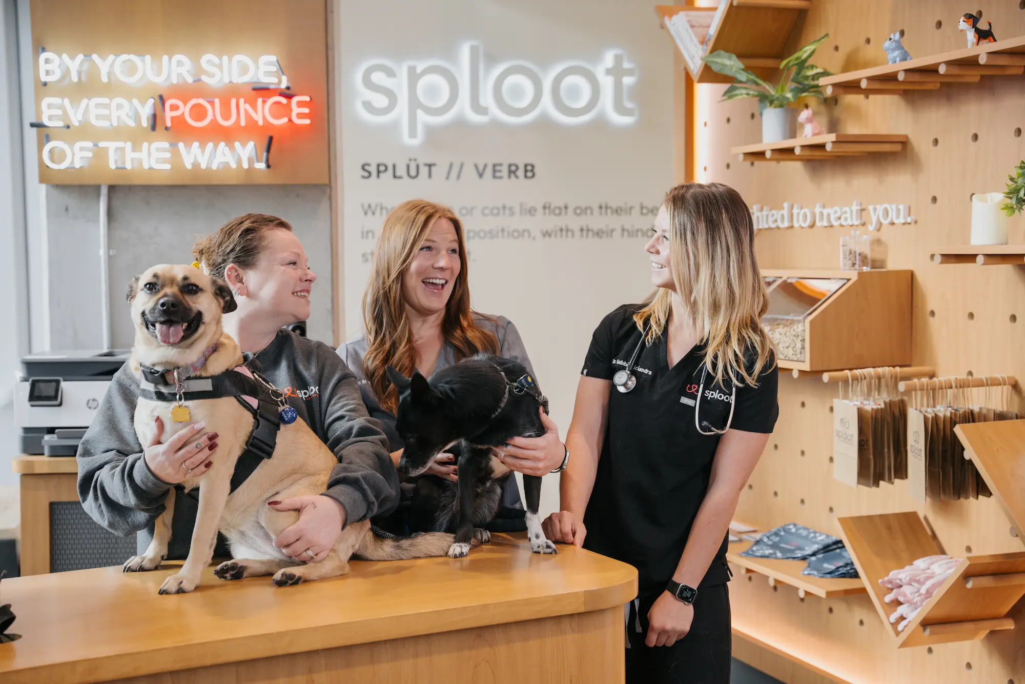
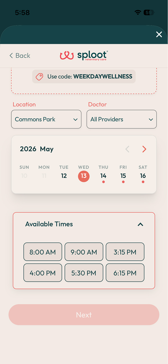
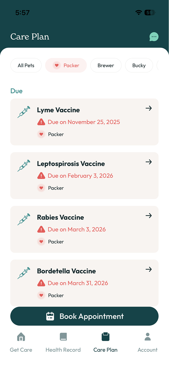
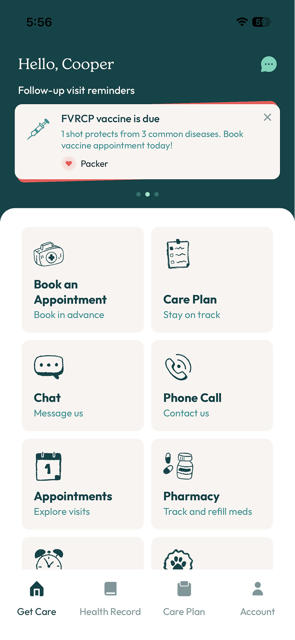
The canonical version of each building block used across splootvets.com — rendered from /styles/sploot-components.css, built on the design tokens. Pick one from the rail — or press ⌘K to search — to see it on its own; switch to a whole family, or the full page, anytime. Markup sits behind each demo’s view code chip.
Audit
Consistency report
A page-by-page audit (June 2026) found the same UI patterns built several different ways across the site. This library shows the recommended canonical version of each, with a ⚠ drift note wherever real variants exist. The headline divergences:
Pattern
Implemented as
Ways
Cards
was 7 bespoke systems — now one .s-card + modifiers (--hoverable · --featured · --bordered · --media) & slots, plus two siblings promoted to their own canonical classes (.cover-card, .why-card, task 23). Migration done (2026-07-09) — wellness-exams' last two holdouts (.cad-grid, .inc-card) are now on .s-panel--cols / .s-card.
0
Steps / timeline
canonical .s-steps / .s-step (dashed coral connector). .how-steps is fully retired (task 22) — emergency-services and wellness-exams both run canonical. .stepper lives on in booking-flow-demo only, a self-contained app-mockup prototype, not a marketing page — same exception as that page's app-style buttons.
0
Tabs
two intentional canonicals for two different jobs: underline .stage-tabs (ARIA tablist + fade panels, arrow-key nav) for content stages, and the segmented .s-pill-tabs pill toggle. The legacy .avail-tabs + .svc-tabs pill switchers are fully retired onto .s-pill-tabs — no live page carries them (verified 2026-07-10). Behavior in /scripts/sploot-components.js.
0
Coupon / promo code
canonical .s-coupon-bar (dark-teal perforated tap-to-copy, + --compact). Rebuilt from .ci-coupon; pinned to the dark palette so it survives theme modes. Migration done (2026-07-10) — today-availability's last-holdout .avail-coupon chip now renders --compact inside its clinic cards.
0
Stats
one canonical .s-panel--cols stats panel, two skins: light trio (wellness-exams) and --inverse dark 4-up (about's proof strip, migrated off its bespoke divide-x grid 2026-07-10 — count-up/reveal JS stays page-local). The third "way" was .plan-savings, which is already canonical and a different job (bordered price-comparison box, not proof stats).
0
Value-prop trio
a stale row (verified 2026-07-10): "plain · featured · pill-badge" are three sanctioned treatments of the one canonical trio (base .s-card · --featured · hover pill badges — see Value-prop trio), not three implementations. splootrx is the only live page shipping a trio and it runs the canonical classes.
0
Accent color
coral #E07A6A + fire-opal #E25E5A — unified as the opal family (opal/100 + opal/120). Code side fully token-clean (2026-07-10): primary-care's pulse JS now sets var(--color-accent), today-availability's legacy wf-sienna aliases var(--opal-120), and reviews' avatar was a false collision (Google-palette hue, now visibly distinct). a-button-demo's pinned lab defaults are a sanctioned exception (color inputs can't take vars). The 1 remaining way is Figma: accent/primary still doesn't carry opal/100 (Phase 3).
1
CSS approach
Webflow utility classes (home.html) vs Tailwind (the rest)
2
Service-page shell
one canonical .svc-page / .svc-section shell (sploot-components.css): page tokens, heading/paragraph defaults, the 1440px section container, the split hero, and the centered .why-head. Re-extracted 2026-07-10 from the three pages' current CSS (the earlier extraction was reverted on merge; this one has the post-sweep .btn/coral/eyebrow fixes baked in) — exactly the 30 rules that were byte-identical across emergency-services, primary-care, and wellness-exams, verified pixel-neutral by computed-style probes at desktop + mobile. Near-identical cousins (per-page .hero .subhead, .acc-head/.how-head, h2 em accent colors) deliberately stay page-local. Markup contract: <main class="pc-page svc-page"> + .svc-section wrappers.
0
Two of these tie back to the Figma color tokens: the accent-color split is the same drift between our CSS and Figma's accent/primary (style guide → color), and the Webflow-vs-Tailwind split is the migration still in progress.
01 · 2 components
Actions
Buttons, CTAs and store badges — the click-me layer.
Actions
Buttons & CTAs
One base — .btn — plus a variant modifier. Coral primary for the moment of conversion; teal solid or outline for secondary actions; the self-contained .btn--link for tertiary / in-flow CTAs.
<a class="btn btn--coral">Book Now</a>
<a class="btn btn--teal">Get the App</a>
<a class="btn btn--teal-outline">Secondary</a>
<a class="btn--link">Explore →</a>

/* legacy aliases still shipping on live pages — same styles:
   .btn-coral · .btn-teal-solid · .btn-teal-outline · .btn-link */
Actions
Store badges
App Store and Google Play buttons. Apple icon stays monochrome; Google Play keeps its branded multi-color triangle. Add .store-badge--light on dark backgrounds.
The hero utility atoms and the location hero they assemble into — parts and whole, side by side.
Hero atoms
Hero utilities
The atoms that dress a hero — a "need care?" prompt, a coral lead-in, an availability status chip, a rating badge, the carded Google-reviews badge (button-column width, per the assembled hero), a coupon card, a location pill, and the "Today's Availability" button (icon corrected 2026-07-06 to match the branded pin+paw mark shipped on splootvets.com/locations/denver — was a generic chat-bubble icon). From the Figma Hero Utilities set; every color resolves to a palette token (no hardcoded hexes).
Hero atoms from the Figma Hero Utilities set (node 2380-53). Colors map to --color-accent (coral), --color-teal, and --mint-100.
Heroes
Location hero
The full location-page hero, assembled from the Hero Utilities atoms. Every part is a boolean you can flip on/off — the same toggles map 1:1 to component properties in Figma & Webflow. The image switches between a framed card and a full-bleed photo, and Google reviews ⇄ Rating badge are an either/or pair.
Image variant
Utilities · toggle on / off
Veterinarian in Denver Highlands
Your neighborhood Highlands vet clinic
Primary & urgent care at 3774 Julian St. Open 8am–8pm, 365 days a year. Same-day & urgent drop-off appointments available.
The assembled location hero — live on Denver Highlands and the Denver hub page (which also adds a third CTA, .hero-availbtn, for its "Today's Availability" link). Built from the Hero Utilities atoms; each toggle is one Figma/Webflow boolean prop. Surface: default is this rounded cream card; add .hero-preview--flat to drop the card and sit on the section's own flat band — one color edge-to-edge, the production city-page look (Denver uses it). Uses .btn-coral + palette tokens (no hardcoded brand hexes).
03 · 9 components
Cards & pricing
One .s-card system and its specializations — value-prop, decision, status, membership pricing, team/doctor cards, nearby locations, and the services carousel.
Cards
Cards
There is just one card — .s-card — with BEM slots (__icon, __number, __eyebrow, __title, __stat, __body, __link) and additive modifiers. Every "card" across the site — page grids, service lists, numbered steps, included-pillar grids — is this one component with different slots/modifiers.
Plain card
Just the base. Title and body, nothing else.
With icon
Icon tile (cream, teal stroke) above the title.
01
With number
Big serif number replaces the icon slot.
Adult Pets
Once a year
Annual wellness exam
Featured
Dark teal background for promo / hero cards.
Bordered
Coral edge for "act now" cards. Hovers up.
Hoverable
Add .s-card--hoverable for the scale + shadow effect.
Ring hover
Add .s-card--hover-ring — no motion; a soft coral inset ring + shadow fade in (the splootvets.com/sploot-financing treatment). Use instead of --hoverable.
Used everywhere cards appear — the homepage grid, primary-care, wellness-exams. Base lives in /styles/sploot-components.css; copy the markup above.
✓ Consolidated
This one section replaces what used to be five separate card demos. The bespoke .pg-card (page grid) and .inc-card (service cards) collapsed into .s-card + slots/modifiers; .cover-card and .why-card were promoted to their own canonical classes instead (task 23) — both are the real, in-use component, not drift. The old .cad-grid visit-cadence table was the same as the Stat trio — wellness-exams now renders it on that canonical component (2026-07-09).
Pharmacy
Value-prop trio (featured)
SplootRx's three-up benefit cards. The middle card is featured — dark teal, white text, coral icon — as the visual anchor. Each has a rounded icon tile (mint, or white/15 on the featured card) and a small pill badge that reveals on hover (shown here). Cards and their icon tiles lift and tilt on hover.
Vet-Approved
Prescriptions pulled directly from your pet's medical record — no calls, no delays.
Instant approvals from your vet
Competitive Pricing
Often priced lower than major online pet pharmacies, with 5%+ off autoship.
Save vs. Chewy & 1-800-PetMeds
Delivered to You
Meds, food & essentials shipped from licensed veterinary pharmacies to your door.
Autoship available — cancel anytime
Used on splootrx. Built on .s-card--hoverable (the lift) + .s-card--featured (the dark middle card, using --color-surface-inverse/--color-text-inverse); only the icon wiggle (.rx-icon-wrap) is bespoke. The old .rx-card / .rx-card-featured classes are fully retired — live splootrx now ships this exact markup.
Status & alerts
Status card
A hero side-card pairing a pulsing green dot with an "Open now" line. Sits under service-page heroes.
Open today, 8am – 8pm
365 days a year, including weekends & holidays
Used on primary-care. Class hooks: .open-card, .pulse.
✓ Consolidated
The open-now dot now uses the canonical .pulse glow (sploot-components.css) instead of a private duplicate animation. The never-deployed .ci-status pill and the old .stat-card (which overlapped the card system's .s-card__stat slot) are retired — .pulse is the one "open" indicator site-wide.
Pricing & membership
Plan comparison (.plan-card / .plan-savings)
Membership vs. pay-as-you-go, on a dark teal band: a glassmorphic "Best Value" card (.plan-card--featured) beside a quieter default card, plus a 3-stat savings breakdown (.plan-savings) below. Promoted from about.html + financing.html (task 27) — both pages had built this independently with real drift (financing's CTA was raw Tailwind instead of the canonical .btn). The container around the cards stays page-local on purpose: about.html wraps them in a swipeable slider, financing.html in a plain grid that stacks on mobile — both are valid, and the card/savings-box visuals work in either.
Based on two urgent care visits and one wellness exam.
Used on about and financing. Class hooks: .plan-card (+ --featured), .plan-card__* slots, .plan-savings.
Pricing & membership
Regional pricing cards
Two-up membership plan cards keyed to a region: a city-skyline image header, an "Only $XXX/year" serif price in coral, a divider, an eligibility line, a perks checklist, and an arrow purchase link. The dark variant inverts the surface to teal; both lift on hover.
Used on membership. Class hook: .rx-card + Tailwind utilities.
⚠ Drift
This is its own .rx-card hover system, separate from the core .s-card — same lift + shadow behavior, could be unified. The price uses coral #E07A6A, but SplootPack callouts use fire-opal #E25E5A for the equivalent emphasis — both are now steps of the opal family (opal/100 + opal/120).
Pricing & membership
Price row
A baseline-aligned label/price listing row for fee and add-on tables. It owns only the flex layout and type — it must live inside a .s-panel--rows, which supplies the dividers and padding. The optional __desc stacks under the name inside a plain wrapper div, and __price--free turns the value green for anything already covered. Built on .s-price-row.
Surgery add-ons
Cold laser therapySpeeds healing and reduces inflammation and pain after surgery.
$59
MicrochipPermanent ID for your pet, placed painlessly while they're under.
Ligasure / electrocauteryAdvanced vessel-sealing for less bleeding and a smoother procedure.
Included
Exam & bloodwork fees
Exam fee — Colorado$89
Exam fee — Illinois$99
Pre-op bloodwork~$150
Exam fee — SplootPack members3 free / yr
Used on spay-neuter (add-on panel and exam-fee panel). Class hooks: .s-price-row, .s-price-row__name, .s-price-row__desc, .s-price-row__price, .s-price-row__price--free — always inside .s-panel--rows (optionally .s-panel--muted), with .s-panel__head as an optional direct-child label.
Cards & pricing
Team / doctor slider
Canonical .s-card--media cards (photo + name + title) housed in the shared .dvr-svc-slider/.dvr-svc-track carousel shell — the same shell the services carousel below uses. Scroll-snap with circular prev/next controls.
Used on location pages (Highlands "Doctors who'll know your dog by name"). Class hooks: .dvr-svc-slider/.dvr-svc-track (shared shell) + .s-card--media/.s-card--hoverable (card). Behavior: /scripts/sploot-components.js (initServicesCarousels).
✓ New 2026-07-10
Highlands' doctor cards were a static grid (no way to browse past the first row on desktop with 5+ doctors). Now a real slider — reusing the services carousel's shell instead of building new carousel JS. initServicesCarousels was generalized to read track.firstElementChild for its scroll-step width instead of hardcoding .dvr-svc-card, so any card type can now ride this shell.
Cards & pricing
Nearby locations
Horizontal, always-scrollable slider of nearby-clinic cards — one .s-card--media link per clinic (photo, name, address, hours + distance, "View clinic"); closes with a centered "see all" underline link.
Used on location pages (Highlands "other locations"). Built on .s-card--media + --hoverable — the whole card is one link, plain Tailwind utilities for the text rows.
✓ Corrected 2026-07-10
This demo previously showed a different internal structure than what's live — separate inner .ol-name/.ol-link anchors, a .ol-open pill, and no distance line. The actual live Highlands markup wraps the whole card in one link, has no open/closed pill (just plain "Open 8am–8pm · ~2 mi east" text), and always includes the distance. Demo now matches live 1:1; the unused .ol-name/.ol-address/.ol-meta/.ol-open/.ol-link CSS was removed from this page.
Cards & pricing
Services carousel
The "What we treat" block: a Services / Symptoms segmented toggle over two panels. Services is a horizontal, scroll-snapping carousel of image-top cards with circular prev/next controls; Symptoms is a responsive grid of concern links with a slide-in arrow on hover.
Used on location pages (Highlands). Class hooks: .s-pill-tabs--teal, .dvr-svc-track, .concerns-grid.
✓ Consolidated
Was a third tab implementation (.svc-tabs) alongside .stage-tabs and .avail-tabs — now built on the shared .s-pill-tabs--teal (task 22 close-out); the legacy .svc-tabs/.svc-tab-btn/.svc-tab-panel classes are retired. Card body copy tokenized to --color-text-muted; link + arrow accent tokenized to --color-accent.
04 · 2 components
Locations
Page-specific location chrome — clinic info card and the embedded map. (Nearby-locations and services cards moved up to Cards & pricing, 2026-07-10 — they're card patterns, not location-specific.)
Locations
Clinic info card
The canonical location card — .s-info-card (a specialization of .s-card): an "open today" status pill (animated green dot), divided icon-rows for address / phone / hours / parking, and an .s-hours list. The dashed dark-teal tap-to-copy coupon below is the separate, reusable .s-coupon-bar.
Used on location pages (e.g. Highlands); the --compact coupon bar also lives in today-availability's clinic cards (replaced the bespoke .avail-coupon chip, 2026-07-10). Class hooks: .s-info-card / .s-info-row / .s-status / .s-hours; coupon copy via /scripts/sploot-components.js (initCouponBars).
Locations
Map card
Rounded embedded Google map with a floating white "Get directions" pill anchored bottom-right (fills coral on hover). Pairs with the clinic info card in a two-column grid on location pages.
The small decorative illustration that sits above a centred section header. The base .s-topper sets no width at all — it only carries display:block, height:auto, and margin: 0 auto var(--space-3), so it centres itself and self-spaces 12px off the eyebrow below. Width is the size modifier's only job, which makes it the one choice you make. Decorative by contract — always ship alt="", aria-hidden="true", and explicit width/height so it can't shift the heading beneath it while loading. --lg and --md step down at ≤640px; --sm is already small and holds its size.
Why it matters
A quick procedure that pays off for a lifetime.
.s-topper--lg · 92px → 76px
Real stories, real relief
Back to their old self in no time.
.s-topper--md · 86px → 72px
Pricing
Premium pet surgery, minus the premium price.
.s-topper--sm · 46px, no mobile step-down
Used on spay-neuter (all three sizes). Class hooks: .s-topper, .s-topper--lg, .s-topper--md, .s-topper--sm.
Content
Feature row
Two-column deep-dive: copy on one side (eyebrow, heading, body, bulleted benefits), a screen-card on the other. Alternate the order between rows for rhythm.
Booking
Booking, without the hold music.
Every Sploot clinic, every available time slot — laid out for you. Pick the service, the day, the vet. Reschedule from inside the app if plans change.
Wellness, urgent, dental, and surgery
Switch between locations on the fly
Calendar invite and reminder push
Booking · Bagel
Annual wellness exam
45 min · Commons Park
9:00 AM
10:30 AM
1:15 PM
3:00 PM
Data display
Checklist
A list of checkmark rows in two treatments. .s-check-row owns the glyph in both; only the wrapper changes. Divided puts hairlines between rows via .s-panel.s-panel--rows (the panel owns the dividers and padding). Gapped uses .s-check-list, which owns the reset and spacing instead. Modifiers sit on the row — --brand swaps the flat token check for the hand-drawn mint one, --inverse flips the text for a dark band — except --inline, which sits on the list and wraps rows into a horizontal run.
Previous medical records (if you're new to Sploot)
A list of any medications or supplements your pet is on
Notes on anything you've noticed at home — even things that seem small
A fresh stool sample if your vet has asked for one
A leash or carrier (and your pet's favorite treat doesn't hurt)
Pre-surgical bloodwork and a full physical exam
An IV catheter and fluids for the whole procedure
A nurse monitoring vitals from first breath to last
Take-home pain medication and a recovery cone
Prevents uterine infections (pyometra)
Reduces the risk of mammary cancer
Calmer behavior and less hormone-driven aggression
Board-certified surgical team
Same-day discharge
Upfront pricing, no surprises
Fear Free handling
Unlimited free exams, every day of the year
20% off spays, neuters, and dental cleanings
Vaccines and preventives included, no add-on fees
Records and visit notes, always in the app
CareCredit and Affirm accepted at every clinic
Open 365 days a year, including holidays
Divided is used on wellness-exams; gapped + --brand on spay-neuter (benefit lists, CareCredit rows). --inverse and --inline are promoted but not yet on a live page. Class hooks: .s-panel.s-panel--rows, .s-check-list, .s-check-list--inline, .s-check-row, .s-check-row--brand, .s-check-row--inverse.
Data display
Panel skins
The surface skins for the divided panel. .s-panel--muted tints the fill to the paper surface — it reads on the cream canvas, and goes flush if the band underneath is already paper. .s-panel--glass is the dark translucent card for dark bands: it brings its own padding and radius, so .s-panel--sm (glass-only) tightens both. .s-panel__head is the optional uppercase label slot — it styles only as a direct child of .s-panel--rows, so it stays unstyled inside a glass panel. The fourth skin, .s-panel--inverse (flush on a dark band, no box of its own), is documented with the stat trio.
Exam & bloodwork fees
Exam fee — Colorado$89
Exam fee — Illinois$99
Pre-op bloodwork~$150
Recovery add-ons
Cold laser therapy$59
Microchip$70
Ligasure / electrocauteryIncluded
That cream band is load-bearing, not decoration. --color-surface-muted resolves to --color-paper (#FAF7F4) — the same value as this demo card's own background — so a muted panel dropped straight onto paper renders an invisible tint. The band above is the honest real-page context: spay-neuter's fee panel sits on a cream section.
Species
Location
Procedure Only
Procedure + Pre-op Exam & Bloodwork
Without SplootPack
$850
$1,090
With SplootPack
$640
$690
Savings
$210
$400
Starting rates for a dog spay in Colorado. Final pricing depends on your pet's size and species — you'll get an upfront estimate at the consultation.
A licensed vet and a dedicated nurse monitoring your pet the whole time
Heart rate, blood pressure, and oxygen tracked from first breath to last
Warmed bedding and pain control ready before your pet wakes up
Used on spay-neuter — the fee panel (--rows + --muted + __head) and the price card (--glass). .s-panel--sm ships unused: it exists in the CSS as the tightened glass step, and this is its only rendering. Class hooks: .s-panel, .s-panel--rows, .s-panel--muted, .s-panel--glass, .s-panel--sm, .s-panel__head.
The green With SplootPack and coral Savings rows above render plain white, not tinted. .s-matrix--inverse td and .s-matrix__row--success td / --accent td have identical specificity, so the later --inverse rule wins and kills both semantic tints wherever the matrix is inverse — including live on spay-neuter's price card. The markup here is deliberately left matching the real page so it self-corrects once the tint rules are moved after the --inverse block (or scoped under it). Fix belongs to .s-matrix, not to the panel.
Content
Fine print
The muted substantiation note that sits under a savings, pricing, or promo claim — required by the messaging guide anywhere we quote a figure. .s-fineprint caps at 60ch and reads left-aligned; .s-fineprint--center centers both the text and the block itself for use under a centered CTA. There is deliberately no --inverse variant: the color flips to translucent white contextually inside .pack-card, .final-block, and .s-panel--glass, so a note dropped on a dark surface can't be left unreadable by an author who forgot the modifier.
SplootPack
Members save an average of $600+ a year*
One flat monthly fee covers three exams a year, then takes a percentage off nearly everything else your pet needs.
*Estimated average annual savings; actual savings vary by pet and services used.
Prices apply to Denver locations only and may vary by clinic. Add-ons are subject to change based on your pet's medical needs; any additional services required during the procedure will be reflected in your final estimate.
SplootPack Membership
A whole year of wellness, covered.
3 free exam visits a year ($267–$297 value)
25% off spay/neuter procedures
10% off bloodwork, meds, vaccines, and everything else
*Pricing shown is a starting estimate for Denver clinics and excludes add-ons.
Pre-op exam, bloodwork, and anesthesia monitoring
Take-home pain medication and an e-collar
A follow-up recheck at no extra charge
*Dog spay, Colorado pricing. Estimates only — we confirm your final quote at the pre-op consult, before anything gets scheduled.
Used on spay-neuter three times: inside the .pack-card savings claim (inverted), centered under the add-on panel's CTA, and on the light CareCredit callout — which sits on .s-split-callout--boxed, a light surface, so it stays muted. Class hooks: .s-fineprint, .s-fineprint--center, .pack-card .s-fineprint, .final-block .s-fineprint, .s-panel--glass .s-fineprint.
Data display
Decision cards (treat vs ER)
Side-by-side triage guidance: a green-accented "we can treat" list and a red-accented "go to the ER" list, each with color-matched checkmarks — helping pet parents self-route. The Checklist's sibling: same check-glyph list DNA, but split into two accent-coded cards instead of one panel. Not clickable, so no hover treatment. (Moved here from Cards & pricing, 2026-07-10 — it's triage content, not a product/pricing card.)
Sploot can treat
Vomiting, diarrhea, or off appetite
Limping, ear infections, foxtails
Cuts, rashes, eye irritation
Sudden lethargy or mild fever
Go to the ER
Collapse or loss of consciousness
Difficulty breathing
Heavy bleeding or major trauma
Suspected toxin ingestion
Used on emergency-services. Class hooks: .dec-card, .dec-list (+ .treat/.er).
Data display
Stat trio
Columns in one panel with vertical dividers. Each cell: uppercase eyebrow → large serif phrase → small subline. Stacks on mobile (3-up → single column, 4-up → 2×2). Built on .s-panel.s-panel--cols.cols-3 / .cols-4.
Puppies & Kittens
Every 3–4 weeks
Until 4 months old
Adult Pets
Once a year
Annual wellness exam
Senior Pets (7+)
Every 6 months
With routine bloodwork
The inverse variant (.s-panel--inverse): flush on a dark band — the section supplies the background, the panel drops its box and flips to white hairline dividers. Coral figures via .s-card__stat--accent. About's proof strip runs this 4-up, with its page-own count-up + reveal wiring and larger figures on top.
365
days open per year
Same-day
appointments, always
90%
of vet needs handled
4
cities and growing
Used on wellness-exams (light 3-up) and about (inverse 4-up proof strip). Class hooks: .s-panel--cols.cols-3/.cols-4, .s-panel--inverse, .s-card__stat--accent + card slots.
✓ Consolidated
About's proof-stat band (dark 4-up with count-up numbers) was the last bespoke stats row — a raw Tailwind divide-x grid. It now renders on this panel via .cols-4 + .s-panel--inverse (2026-07-10); the count-up and scroll-reveal stay page-local JS, and .plan-savings remains its own canonical component (a bordered price-comparison box, not a proof-stats row).
Data display
Comparison matrix
The canonical pricing / coverage table: tabular numerals so columns of dollars line up, semantic row tints for the member price and the saving, and a sticky first-column label that stays put while the value columns scroll. Always wrap the table in .s-matrix__scroll — it supplies the horizontal overflow and the right-edge fade; below 720px the table holds a 480px minimum width. Built on .s-matrix.
Wellness exam
Core vaccines
Annual bloodwork
Without SplootPack
$89
$145
$180
With SplootPack
Included
$131
$162
You save
$89
$14
$18
Starting rates. Final pricing varies by pet size, species, and location — you'll always get an upfront estimate before we begin.
Procedure Only
Procedure + Pre-op Exam & Bloodwork
Without SplootPack
$850
$1,090
With SplootPack
$640
$690
Savings
$210
$400
Dog spay, Denver. Includes procedure, pre-op exam, and bloodwork — no hidden fees, just clear, upfront pricing.
Used on spay-neuter (inverse skin, inside the glass pricing card). Class hooks: .s-matrix__scroll, .s-matrix, .s-matrix--inverse, .s-matrix__row--success, .s-matrix__row--accent. Two gotchas worth knowing: the light skin's sticky tbody th paints itself var(--color-surface) to mask the cells sliding under it, so it only reads on a surface-colored parent — put it in an .s-panel, not straight onto paper. The inverse skin's sticky label is background: transparent, so on a narrow viewport the value cells scroll visibly through it; give the label a background if you ship a genuinely scrolling inverse table. Empty and unavailable states stay with the consumer — that's data policy, not component.
Data display
Steps timeline
Numbered process flow with a dashed coral connector between the circles. Connector hides on mobile; circles stack 2-up. Built on .s-steps / .s-step.
1
Check-in & history
A quick weigh-in and a chat about how things have been at home — appetite, energy, new behaviors.
2
Nose-to-tail exam
Your vet checks heart, lungs, eyes, ears, mouth, skin, joints, and abdomen. About 15 minutes hands-on.
3
Vaccines & diagnostics
Any boosters or in-house lab work happen in the same visit. Most bloodwork comes back same day.
4
Plan & takeaways
You leave with clear notes, refilled preventives if needed, and an upfront estimate for next steps.
Used on wellness-exams. Class hooks: .s-steps, .s-step, .s-step__num.
Data display
Tabs
ARIA tablist + panels. Active state darkens the text and adds a thick teal underline. Active panel is a two-column card (image + copy) that fades up on switch. Built on .stage-tabs / .stage-panel.
The first year, set up right.
Vaccine series, spay/neuter, training basics, and a comfortable introduction to lifelong vet visits — at your pup or kitten's pace.
Adulthood, on cruise control.
Annual exams, boosters, dental cleanings, and quick check-ins whenever something feels off. Routine made easy.
The golden years, with more attention.
Twice-yearly exams, senior bloodwork, and gentle conversations about comfort, mobility, and quality of life.
The canonical reusable ARIA tab pattern. Behavior: /scripts/sploot-components.js (initStageTabs) — click + arrow/Home/End keys + roving tabindex. primary-care's "by life stage" section is a richer, page-specific variant under its own .ls-* classes — deliberately separate from this so the .stage-* names have one meaning.
Data display
Pill tabs
A segmented-control tab — the canonical home for the location .avail-tabs and services .svc-tabs pill switchers (distinct from the underline .stage-tabs above). Full WAI-ARIA tablist: arrow / Home / End keys, roving tabindex, visible focus. Two skins — --paper and --teal.
Several labelled pill-tab controls in one wrapping row — the dark-band pricing selectors on spay-neuter. .s-filter-bar supplies only the caption and row rhythm; each group stays its own independent tablist. The base tabs, the --paper / --teal skins and the keyboard nav are at Pill tabs above — this covers the --inverse delta only. Both halves are dark-only and must stay inside .s-panel--glass: the label goes white purely via the contextual .s-panel--glass .s-filter-bar__label rule. Drop that ancestor and it falls back to --color-text-subtle — midnight-eagle at 55%, invisible on a dark band.
Species
Location
Gender
Used on spay-neuter (pricing card, paired with .s-matrix--inverse). Class hooks: .s-filter-bar, .s-filter-bar__group, .s-filter-bar__label, .s-pill-tabs--inverse, .s-pill-tab, inside a required .s-panel--glass. Base tabs, keyboard nav and disabled/focus states: Pill tabs + /scripts/sploot-components.js (initPillTabs).
Navigation
Service link rows
Horizontal link rows for secondary / "beyond the basics" services. Title + meta left, circular arrow right that fills coral on hover. Built on .beyond-link.
A left-bordered callout (fire-opal accent) for urgent, can't-miss guidance. The red is fixed regardless of palette — it signals urgency, so it shouldn't shift with the theme.
If your pet is collapsed, struggling to breathe, or bleeding heavily, call us now at (720) 770-8656 — don't wait for an appointment.
An infinite horizontal ticker of brand promises in serif, with a brand icon from /assets/iconography/ acting as a centered separator between each pair — not attached to either side. Pauses on hover and stops entirely under reduced-motion. The track holds two copies of the set so the loop is seamless.
Open 365 days a yearSame-day appointmentsOnline pharmacyFear Free certifiedBook in under a minuteOpen 365 days a yearSame-day appointmentsOnline pharmacyFear Free certifiedBook in under a minute
Used on highlands. Class hooks: .marquee, .marquee-track, .m-ico.
Banners & misc
Newsletter signup
A single-field email capture — a coral-outlined pill input with the submit button tucked inside on the right (coral, for contrast on dark footers).
Used in the homepage footer. Class hook: .newsletter-form.
Banners & misc
Referral banner
A thin, dismissible announcement bar — short message, an inline link, and a close button that removes it.
🎁 Refer a friend — you both get $25 off. Learn more
Used on home (top of page). Class hook: .referral-banner.
07 · 3 components
Social proof
Reviews, testimonials and video stories.
Social proof
Google reviews widget
A dark-teal review organism: an aggregate rating header (Google "G", 4.9, stars, review-count link) over a horizontal scroller of light mini-review cards — clamped quote, "read more", an initials avatar, a verified check, and Google attribution. Prev/next arrows flank the rail.
Booking used to mean phone tag for a week. Now I tap a reminder and Bagel's annual is on the calendar in 20 seconds. The whole team is kind and the app is genuinely useful.
Reordering Pretzel's heartworm meds used to mean a phone call and a pharmacy trip. Now I tap once in SplootRx and it shows up at the door. Pricing beat Chewy too.
The vet techs texted me photos during Mochi's dental and walked me through every line on the estimate first. No surprise bills, no upsell — just clear care.
Switched from a big-box clinic and the difference is night and day. Upfront pricing, a care team that remembers Cooper's name, and zero waiting-room stress.
Used on reviews and about. Class hooks: .cr-gwidget, .cr-grv.
⚠ Drift
Distinct from the card-grid testimonials — this is a separate dark-container review system with its own scroller + arrows. The star rating reuses fire-opal/coral; verified + Google marks are hardcoded brand blues (intentional, third-party).
Content
Testimonials
Coral five-star rating, body quote, then a small avatar + name + location/pets line. Three cards in a row at desktop.
"Booking used to mean phone tag for a week. Now I tap a reminder and Bagel's annual is on the calendar in 20 seconds."
M
Maya R.
Denver · Bagel & Mango
"Reordering Pretzel's heartworm meds used to mean a phone call and a pharmacy trip. Now I tap once in SplootRx."
J
Jordan P.
Chicago · Pretzel
"Vaccine certificates pulled up at boarding check-in — no more digging through emails."
S
Sam & Tess L.
Salt Lake City · Biscuit
Social proof
Video stories
A horizontal scroll-snapping rail of 9:14 video-testimonial cards — poster image, play disc (fills coral on hover), a topic pill (top-left) and duration badge (bottom-right), with a serif title and pet-parent avatar below. Swipe or scroll.
Urgent care1:24
"They saved Bagel's evening."
Maya R. · Denver
Senior care2:03
"Gentle with our old girl."
Jordan P. · Chicago
Wellness0:58
"Booking took 20 seconds."
Sam & Tess L. · SLC
Dental1:47
"No more dreading the vet."
Priya K. · Denver
Used on reviews. Class hooks: .cr-scroller, .cr-video-card.
⚠ Drift
A fourth horizontal-carousel implementation — alongside .dvr-svc-track (services), the testimonial slider, and the Google-reviews scroller below. Each hand-rolls its own scroll/snap markup.
08 · 6 components
App & conversion
App showcase, download CTAs and booking blocks.
Sections & CTAs
App showcase
The cross-page app section that sits above the final CTA — exactly as it ships on the homepage: a radial-teal card with a green eyebrow, a New Spirit headline (coral italic accent), copy, translucent store badges, and a fanned trio of app screenshots (a center phone device flanked by two tilted shots).
The Sploot app
Your pet's whole health, in your pocket.
Records, reminders for vaccines, checkups and medications, easy appointment booking, and prescription refills — all your pet's care in one place.
Live on the homepage as the self-contained .sa-* block. Class hooks: .sa-card, .sa-badge, .sa-fan / .sa-phone.
Sections & CTAs
App download CTA
Dark teal rounded panel for the bottom of the app landing page. Headline + copy + store badges on the left, QR card on the right. Drives installs, not appointments.
Bring your pet's care everywhere.
Download the Sploot app and book, refill, remember — wherever the road takes you both.
The app-hero treatment — a phone mockup with notification "chips" floating around it (gentle staggered up/down drift). Each chip is a white pill with a colored icon dot and a short label. Motion respects reduced-motion.
Refill ready
Appt confirmed
Vaccine due
Used on app. Class hooks: .float-chip (+ the .phone mockup).
Sections & CTAs
Booking CTA
Dark teal closing CTA for service pages. Centered headline with peach italic accent, supporting copy, then two canonical .btns — .btn--coral + the dark-band .btn--outline-invert — so both CTAs share one box model and stay the same size. Decorative mint blob in the corner. Built on .final-block.
Ready to meet your new vet?
Same-day appointments, 365 days a year, at every Sploot clinic. Book in under a minute or call us.
SplootPack-red promotional band for SplootPack Membership. Left: white eyebrow → serif heading with underlined italic accent → perks (white checkmarks) → white pill CTA. Right: a photo panel — always ship an image here, as both live pages do; the opal gradient underneath is only a loading/missing-asset fallback (an empty .pack-visual renders the whole band solid red). Single column on mobile. Built on .pack-card.
The neutral copy + media promo — eyebrow, heading, lead, check-list, CTA and fineprint in a 1.1fr/1fr grid beside an image. .s-split-callout is bare on the section background; --boxed surfaces it as a bordered white card and rounds the image; --reverse lets the media lead. Below 1024px both collapse to one column, and --reverse resets its ordering so copy always reads first on mobile. Note the component styles no typography of its own — the consuming page supplies the heading, italic accent and lead (spay-neuter sizes the heading at 48px via .svc-page + a page rule). The demos below stand that in with token inline styles; copy them, or inherit from your page shell.
Pay over time
Paying over time with CareCredit.
We get it — timing isn't always perfect. That's why we accept CareCredit®, a healthcare credit card that lets you pay over time for any procedure over $200. Most plans include 6–18 months of no-interest financing if paid within the promo period.
See if you prequalify in seconds — no impact to your credit score
*Subject to credit approval. See carecredit.com for details.
Before the big day
What happens before surgery.
Every spay and neuter starts with a full physical exam and pre-op bloodwork, so we know exactly how your pet's body will handle anesthesia before anything is scheduled.
A nose-to-tail exam with the vet performing the procedure
Pre-op bloodwork run in-house, usually back the same day
Used on spay-neuter. Class hooks: .s-split-callout, .s-split-callout__copy, .s-split-callout__media, .s-split-callout--boxed, .s-split-callout--reverse. Composes .eyebrow-wf, .s-check-list, .btn, .s-fineprint.
09 · 2 components
Site chrome
The shared nav and footer — byte-identical on every page, CI-checked.
Navigation
Navbar
Sticky mega-header with backdrop blur — brand left, primary nav center, coral "Book Now" right. Hover Locations or Services to reveal the mega-dropdown. Below md the nav collapses to a hamburger drawer.
Hover Locations or Services to preview the mega-dropdown
Used on every page. Lives inline per file with mega-dropdowns for Services / Locations. Class hooks: .mega-header, .mega-nav-item, .mega-dropdown.
Navigation
Footer
Dark teal panel: a newsletter signup + contact/socials/QR column on the left, then Services / Locations & Company / Resources & Store sitemap columns. Store badges replace the QR code on tablet/mobile. Promoted from the sandbox homepage as the sitewide canonical, 2026-07-06 — replaces the earlier simplified 4-column version this page used to show.
Stay in Touch!
Get the scoop on promotions, new clinics, events and more!
Used on every page except the two frozen Webflow exports (home.html, locations/denver/index.html). Canonical source: website/partials/footer.html, enforced identical on every page by npm run check:partials. Requires sploot-components.css (.store-badge).
10 · 3 components
Motion & accents
Reveal-on-scroll motion and the hand-drawn accent set.
Motion
Motion
Reveal-on-scroll (subtle rise + fade) for content as you read down a page, and a staggered entrance on grids (cascading 120ms delay). Both use .reveal and the --ease-out-expo curve. See the style guide for the easing/duration tokens.
Item one
Item two
Item three
</> View code
<div class="reveal">…</div>                       /* JS adds .in when in view */
<div class="reveal" style="transition-delay:.12s">…  /* stagger via delay */
Banners & misc
Scribble underline
A hand-drawn underline that sweeps beneath an accent word — the reviews-page take on the brand's italic-underline headline accent. Drawn from the shared brand accent set and masked to the coral token, so it always tracks the palette.
⚠ Superseded
.cr-scribble is the same recipe as the canonical .s-accent-mark--underline-straight — same /assets/accents/line-straight.svg, same mask-and-tint. It survives only because reviews hasn't been migrated yet. Use Accent marks for new work; this section goes away when reviews moves over.
Pet parents love us.
Used on reviews. The stroke is the brand accent /assets/accents/line-straight.svg masked to var(--color-opal). Class hook: .cr-scribble.
Content
Accent marks
The hand-drawn brand mark laid over a headline word or figure. .s-accent-mark is the positioning box — it also sets white-space: nowrap, so a marked phrase never breaks across lines — and a modifier supplies the shape. The mark is always a masked SVG tinted with --color-accent, never a raw background: url(): every file in /assets/accents bakes its own red and none of them is the accent token.
Neutering, handled gently.
A nose-to-tail exam.
Rated 4.8 by Denver pet parents.
Vaccines and microchip, one visit.
A happier, healthier pet starts here.
Used on spay-neuter — .hero-accent-word in the hero H1, .s-accent-mark--circle around the rating-badge score — and in the hero H1 on denver and denver/highlands. .hero-accent-word is the legacy alias for .s-accent-mark + .s-accent-mark--underline-curved; new work should use the canonical pair. Class hooks: .s-accent-mark, .s-accent-mark--underline-curved, .s-accent-mark--underline-straight, .s-accent-mark--circle, .s-accent-mark--sparkle, .hero-accent-word.

.webp)





.webp)




.webp)